

Saturday, October 2, 2010
The Baltimore Free Farm Kickstarter Campaign launched today!
Today is an exciting day for my collective, The Baltimore Free Farm, as we just launched our campaign on Kickstarter.com! Just getting accepted was an honor, as many projects are turned away. We worked very hard on the video, featuring recordings we made ourselves of some of the local bands we work with. Please let me know what you think!
 This poster designed by Abid!

Wednesday, September 15, 2010
Project 2 Results.
It is a requirement for Digital Design class that we post all of our projects in this blog, so here's our first one, which is called Project 2, mysteriously.

The assignment was to draw a small, mechanical, man-made object, with moving parts, in black and white. Next we had to convert the drawings in vector graphics. We specifically had to do it in Illustrator, and we were extremely restricted as to which tools we could use. I am not totally thrilled with my results, but "balance" isn't my best skill, so I feel that I did ok, considering.
No one seemed to notice that I misspelled the last drawing, despite the fact that I drew it from life. How is that even possible?
Coming soon:
My interview with Erin McLaughlin, concerning her cartoon-free childhood, and it's troubling long-term effects.
The assignment was to draw a small, mechanical, man-made object, with moving parts, in black and white. Next we had to convert the drawings in vector graphics. We specifically had to do it in Illustrator, and we were extremely restricted as to which tools we could use. I am not totally thrilled with my results, but "balance" isn't my best skill, so I feel that I did ok, considering.
No one seemed to notice that I misspelled the last drawing, despite the fact that I drew it from life. How is that even possible?
Coming soon:
My interview with Erin McLaughlin, concerning her cartoon-free childhood, and it's troubling long-term effects.
Saturday, September 11, 2010
It's that time of year again.
I'm having a rough couple of weeks. I won't go all into it, but as a result, I haven't slept much lately. I got about an hour last night, and now feel wide awake, and super stressed. I decided that since I'm up anyway, I might as well be doing schoolwork. While I was reading our blogs, I saw this in Mark Skalla's:
This reminded me of something special. Something that seems appropriate for both this blog, and my current emotional state. Something I've loved for a long time. Things are sometimes safer to love.

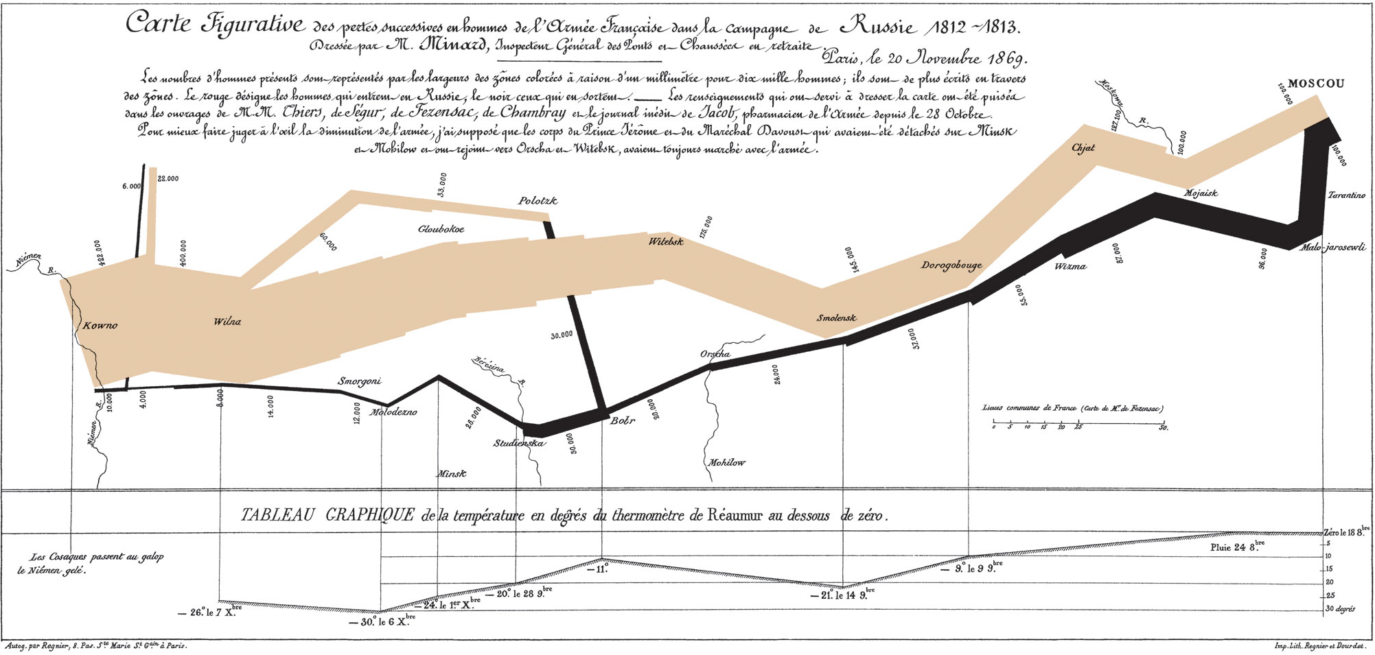
The above is a map by Charles Joseph Minard, a civil engineer from France.
This is what it says (translated into English by I-don't-actually-know-who, but I can read just enough French to know that it's accurate):
I know that there are a lot of people who would not consider this art, and I'd like to take this opportunity to scold them. This might be my very favorite creative *thing* that I've ever seen, as far as creative *things* go. I find it heart-stoppingly beautiful. But then, I'm a sucker for tragedy.
Here's what legendary Yale Professor Edward Tufte famously said about this map:
BEST?! EVER?! DRAWN?! That's some strong praise, from a strong source. If you're taking this class, and haven't heard of Edward Tufte, I strongly urge you to follow his link, and get to know his work.
Anyway, back to me and my melodrama. (So educational, you could almost forget it's the internet, right? WRONG.) I really wish I was making this up, but what you are about to read is both humiliating and completely true.
A few years back, I had the pleasure of seeing the Map show at the Walters. I almost didn't make it due to my near-constant crazy scheduling problems, and got there on the last day. After waiting in line for over two hours(!) to get in, I trolled the halls hungrily. I saw maps by Leonardo da Vinci and J. R. R. Tolkien, among others. You could actually hear the dice bags jingling on the geeks in attendance, honest to G-d. Nerd heaven. It was all lovely, and an historic time was had by all, blah blah blah.
Then, I saw it from across the room.
There's one in every story.
It wasn't even the original drawing, but it was one of the first edition prints. Like the images here, the "grey" band had been replaced with fragile, hand-burnished gold leaf. The light played on it delicately. It wasn't very large, but my eyes were fixed on it, even from the other side of the expansive gallery. I let out a cry, attracting condemning looks and head-shaking from the other attendees. It was the reason I had come.
I ran, full-tilt ran to it, and began openly and loudly weeping.
Link to a larger image of the map:
http://upload.wikimedia.org/wikipedia/commons/2/29/Minard.png
Perhaps some day in the future I'll be able to take the creative thoughts in my head and accurately display them for others.
This reminded me of something special. Something that seems appropriate for both this blog, and my current emotional state. Something I've loved for a long time. Things are sometimes safer to love.
The above is a map by Charles Joseph Minard, a civil engineer from France.
This is what it says (translated into English by I-don't-actually-know-who, but I can read just enough French to know that it's accurate):
Map representing the losses over time of French army troops during the Russian campaign, 1812-1813.
Constructed by Charles Joseph Minard,Inspector General of Public Works retired.
Paris, 20 November, 1869.
The number of men present at any given time is represented by the width of the grey line; one mm, represents ten thousand men. Figures are also written besides the lines. Grey designates men moving into Russia; black, for those leaving. Sources for the data are the works of messrs. Thiers, Segur, Fezensac, Chambray and the unpublished diary of Jacob, who became an Army Pharmacist on 28 October. In order to visualize the army's losses more clearly, I have drawn this as if the units under prince Jerome and Marshall Davoust (temporarily separated from the main body to go to Minsk and Mikilow, which then joined up with the main army again,) had stayed with the army throughout.
I know that there are a lot of people who would not consider this art, and I'd like to take this opportunity to scold them. This might be my very favorite creative *thing* that I've ever seen, as far as creative *things* go. I find it heart-stoppingly beautiful. But then, I'm a sucker for tragedy.
Here's what legendary Yale Professor Edward Tufte famously said about this map:
Probably the best statistical graphic ever drawn, this map by Charles Joseph Minard portrays the losses suffered by Napoleon's army in the Russian campaign of 1812. Beginning at the left on the Polish-Russian border near the Niemen River, the thick band shows the size of the army (422,000 men) as it invaded Russian in June 1812. The width of the band indicates the size of the army at each place on the map. In September, the army reached Moscow, which was by then sacked and deserted, with 100,000 men. The path of Napoleon's retreat from Moscow is depicted by the darker, lower band, which is linked to a temperature scale and dates at the bottom of the chart. It was a bitterly cold winter, and many froze on the march out of Russia. As the graphic shows, the crossing of the Berezina River was a disaster, and the army finally struggled back into Poland with only 10,000 men remaining. Also shown are the movements of auxiliary troops, as they sought to protect the rear and the flank of the advancing army. Minard's graphic tells a rich, coherent story with its multivariate data, far more enlightening than just a single number bouncing along over time. Six variables are plotted: the size of the army, its location on a two-dimensional surface, direction of the army's movement, and temperature on various dates during the retreat from Moscow.
BEST?! EVER?! DRAWN?! That's some strong praise, from a strong source. If you're taking this class, and haven't heard of Edward Tufte, I strongly urge you to follow his link, and get to know his work.
Anyway, back to me and my melodrama. (So educational, you could almost forget it's the internet, right? WRONG.) I really wish I was making this up, but what you are about to read is both humiliating and completely true.
A few years back, I had the pleasure of seeing the Map show at the Walters. I almost didn't make it due to my near-constant crazy scheduling problems, and got there on the last day. After waiting in line for over two hours(!) to get in, I trolled the halls hungrily. I saw maps by Leonardo da Vinci and J. R. R. Tolkien, among others. You could actually hear the dice bags jingling on the geeks in attendance, honest to G-d. Nerd heaven. It was all lovely, and an historic time was had by all, blah blah blah.
Then, I saw it from across the room.
There's one in every story.
It wasn't even the original drawing, but it was one of the first edition prints. Like the images here, the "grey" band had been replaced with fragile, hand-burnished gold leaf. The light played on it delicately. It wasn't very large, but my eyes were fixed on it, even from the other side of the expansive gallery. I let out a cry, attracting condemning looks and head-shaking from the other attendees. It was the reason I had come.
I ran, full-tilt ran to it, and began openly and loudly weeping.
Link to a larger image of the map:
http://upload.wikimedia.org/wikipedia/commons/2/29/Minard.png
Wednesday, September 1, 2010
Abstract Vs. Non-Objective: Inka Essenhigh
One of the first things I've learned in Digital Design Foundation class: I've always mixed up the term "Abstract," with "Non-Representational."
For whatever reason, this reminded me of an artist that I love, Inka Essenhigh. I used to check in on her regularly, but it's been too long.
My favorite of her pieces:

White Rain
2001
oil on enamel on canvas
72 x 74 inches
I don't even know where to start, with reasons why I LOVE this painting. I've always been attracted to surrealism. I can't even remember a time when I didn't know who Salvador Dal í was, and I distinctly remember crying when he died. It was two days before my eleventh birthday. Also, there's the humorous treatment of an iconic product, a cocked and loaded pop-cultural symbol of all my 1980's-flavored, adolescent, pre-feminist turmoil. My older sister WAS White Rain Hairspray, my model of all that was Woman, all that was complicated, all that was unrealistic expectations. The smell filled the house. But it's not all angst: The beautiful Mucha-inspired lines are art to live with, still decorative and soothing as the color scheme, even as the acid rain of chemicals assaults the unicorn figures, melting them.
For whatever reason, this reminded me of an artist that I love, Inka Essenhigh. I used to check in on her regularly, but it's been too long.
My favorite of her pieces:
White Rain
2001
oil on enamel on canvas
72 x 74 inches
I don't even know where to start, with reasons why I LOVE this painting. I've always been attracted to surrealism. I can't even remember a time when I didn't know who Salvador Dal í was, and I distinctly remember crying when he died. It was two days before my eleventh birthday. Also, there's the humorous treatment of an iconic product, a cocked and loaded pop-cultural symbol of all my 1980's-flavored, adolescent, pre-feminist turmoil. My older sister WAS White Rain Hairspray, my model of all that was Woman, all that was complicated, all that was unrealistic expectations. The smell filled the house. But it's not all angst: The beautiful Mucha-inspired lines are art to live with, still decorative and soothing as the color scheme, even as the acid rain of chemicals assaults the unicorn figures, melting them.
Friday, August 27, 2010
Thursday, August 26, 2010
An Introduction to my So-Called Life, that shall result in Art.
Hi. I'm AG. I live in a rowhouse in Baltimore City with 2 dogs, 3 cats, and 7 other adults. Honestly.
The house is called Monster.

See, we all work at this garden...
 |
| The south-western corner of the Ash Street Garden |
And it's very beautiful, and we love it a lot. But we don't make very much money, so we all sort of became a family, in order to survive "the Depression."
People that live in my house include:
 | ||||
| Andrew |
 |
| Jamie |
 | ||||
| Allison |
 | |
| Billy |
 | |||
| Joiya |
 |
| Kenny |
 |
| My partner, Mastodon |
 | |
| and me. |
I have six paying jobs, but I'm always laid off from most of them. In order to survive, we all do little things for money, here and there. Sometimes, the things I do are very successful, but even then, they don't usually bring in much money. Recently, a piece of art that I made appeared in a prestigious blog called THERE WERE TEN TIGERS, and even in the Washington Post, but I didn't make any money off of it.
I grew up very poor, and it's hard to miss something, when you never had it in the first place, I guess.
Sometime last month, it occurred to us, we are so poor, the government will pay us to go to college! All of the gardeners decided to go, not just the ones I live with.
 |
| There was much rejoicing. |
However, this is admittedly a last-minute, and hare-brained, scheme. Art remains important to me. I haven't taken an art class in 22 years, so I opted to take Digital Design Foundation, as a way to get a more formal perspective. This blog is an assignment for that class, which means that future installments will center more around my interest in visual art, in general, and probably cartoons in particular.
I hope you've enjoyed feasting your eyes on my lovely friends, because it's going to be a lot more Masters of the Universe from here on out.
Subscribe to:
Posts (Atom)